Friday, 27 January 2012

Digipak Design Update #1


Front Cover


Back Cover


Interior (left side)


Back (L) and front (R) covers

Above are the designs for the backgrounds I am planning to use for three of the sides of the Digipak design. Like the poster, I recreated images from the music video on the computer, to make it look less like a plain still image from the video itself.

Friday, 20 January 2012

Poster Design Update #3


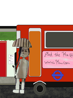
The poster has been updated, with the main character added in from a real background shown in the music video to the digital one for the poster.

Here I have also been expirementing with fonts, and have applied my final choice of font - Poor Richard.

Tuesday, 10 January 2012

Poster Design Update #2


Here I have demonstrated how I created the background, step-by-step, and placed my character in front of it.

Thursday, 5 January 2012

Poster Design Update #1


Today I worked further on creating the poster for the music video. I will be keeping the design featuring the man waiting for a bus, but instead of using paper cutouts, it was suggested to me that I use the computer to recreate the image. The reason for this was so that the poster seemed more original than simply using a still, plus giving the poster itself a greater effect and impact on the spectator.

I created the first of the images in MS Paint, based on the second image, and will later be importing the man as a paper cutout onto the first image to create the poster.